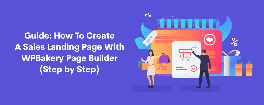
How To Create A Sales Landing Page with WP Bakery Pagebuilder (step by step)
Everyone loves good deals and sales. But no one wants to browse through searches to dig the gold mine. Landing pages are a perfect solution to this problem.
With PB All-in-One Web Addons, you can create stunning landing page layouts in minutes. It is a collection of clean, easy-to-use, and functional add-on elements that helps you do your work with zero-hassle.
In this step by step guide, we will create a landing page for an e-Commerce fashion store using the PB Web Elements. The catch is the Surprise year-end sale.
Elements To Create A Landing Page
Not all landing pages are the same in design; they vary according to the marketing needs and requirements. For our sales landing page, we will use the following elements on our page to grab the maximum leads and increase sales:
- A logo in the header
- A hero section with a heading and a Pop-up Modal with sales detail.
- A service section using the PB Services element
- A section about the company using Text Block Element
- A gallery using the Image Carousel
- A footer with social links
To know more about the landing page elements, please refer to our article; Ultimate guide on Landing page essentials and Why they are considered an effective marketing tool.
Steps To Create A Landing Page
Follow the steps below to create your sales landing page.
- Create a New Page
- Add A Logo
- Hero Section with a Heading and CTA
- Show Services Offered by the Store
- Text Block for Store Intro
- Product Gallery
- Footer With Social Media Links
Create a New Page
- Go to the Admin dashboard, navigate to pages and select Add New.
- The following page will appear when you add a new page.
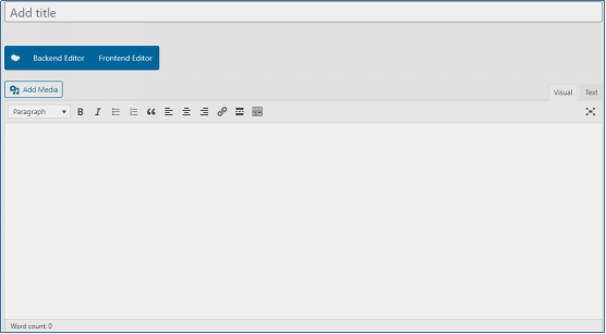
- We will customize the page with the editor of WP Bakery Page Builder.
Adding A Logo as the Header
Logos provide an identity to your business. It helps customers recognize you wherever you are on the web. For sales, it is ideal to use logos on your page. Follow these steps to mark your unique identity to the page:
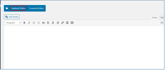
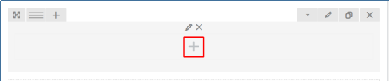
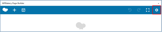
- Click on the back-end editor to activate the editor.
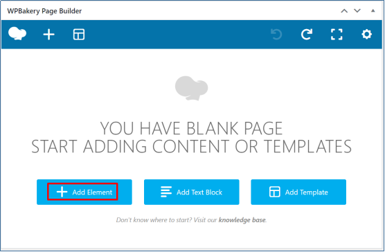
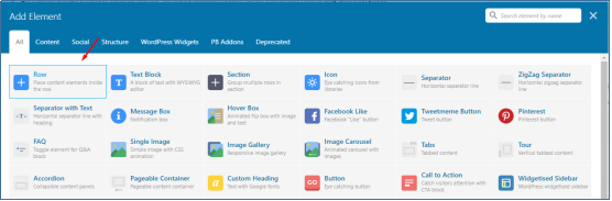
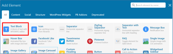
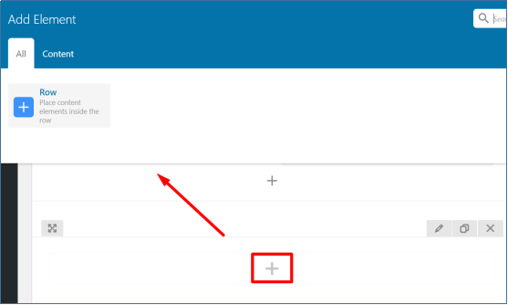
- The following page will appear. Click on the ‘Add element.’
- Select the Row button.
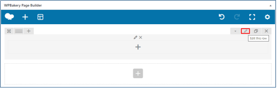
- Edit the row settings from the edit button on the right.
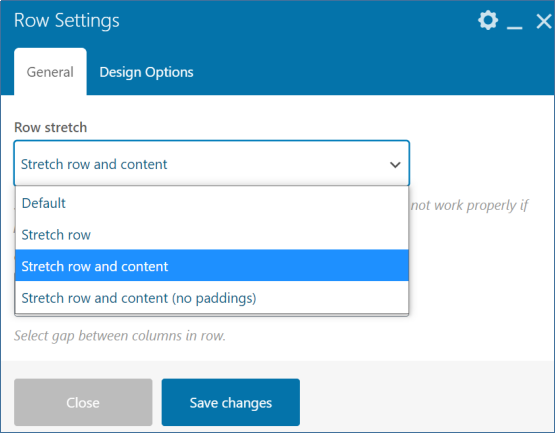
- From the General settings, change the type from default to Stretch row and content.
- Next, scroll down to spacing and transform and customize the top and bottom padding to 0px.
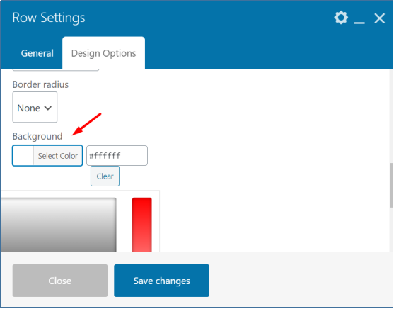
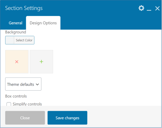
- Move on to the background tab, change the background color, add an image(from the media library), save the changes, and close the dialog box.
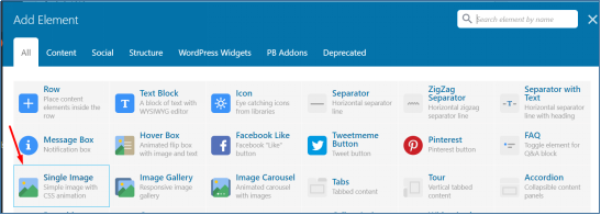
- Click on the plus button and add a Single Image Element from the dialog box.
- Edit and customize the Image as per requirements and save changes.
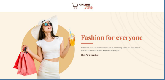
- Your page will appear as below on preview.

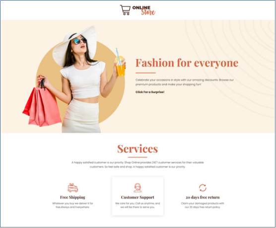
Hero Section with a Heading
The Hero Section is the first area that communicates with the visitors and is always above the fold. We will add an attention-grabbing headline for our sales landing page using the Headings Element, along with some brief descriptions. The clickable text will be the CTA opening up as a pop-up using the PB Element Pop-up Modal.
- Click on the Add element just below the last added
- Add theSection element.

- Click the edit button on the top right of the section.
- Add the background image to the section from the design options tab.
- Save changes.
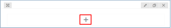
- Inside the section, click on the plus button again to add a row element.
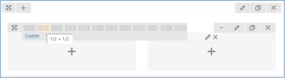
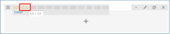
- After adding a row, split the row into two by selecting custom layout option 1/2 + 1/2.
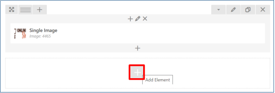
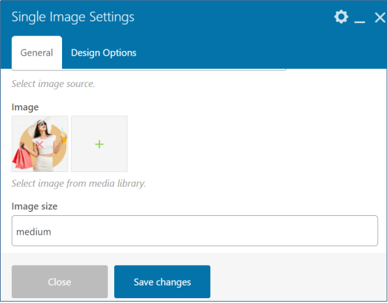
- Click on the first column’s plus button and add a Single Image Element from the dialog box.
- Edit and customize the Image as per requirements and save changes.
- In the second column, click on the plus button and navigate to the page Builder Add-ons tab to add the Text Block Element.
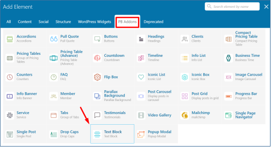
- A dialog box will appear. Add the Heading Text, Border Position, Border Styles, Text, Text Color, Font Family, and Font Styles. Save Changes.
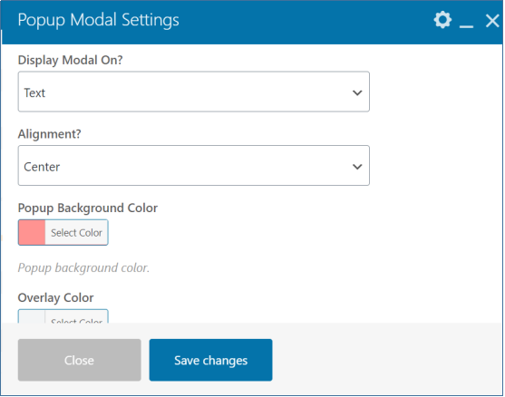
- Append another element below the Text Block Element to add a Pop-up modal from PB Add-ons.

- A dialog box will appear for Pop-up Modal settings. Choose on what you want the pop-up modal to be displayed. For our page, we have selected text.
- Add Background Color and Save changes.
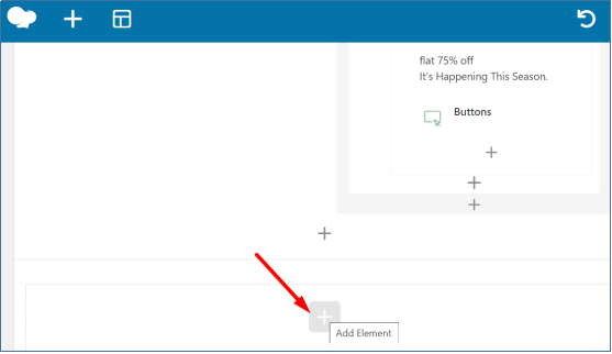
- Inside the pop-up modal block, Click on the plus button to add a row.
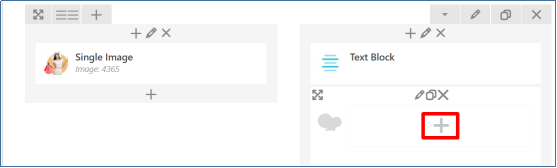
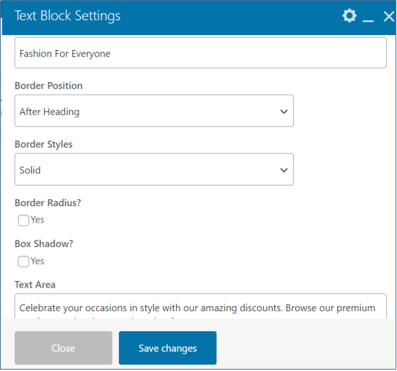
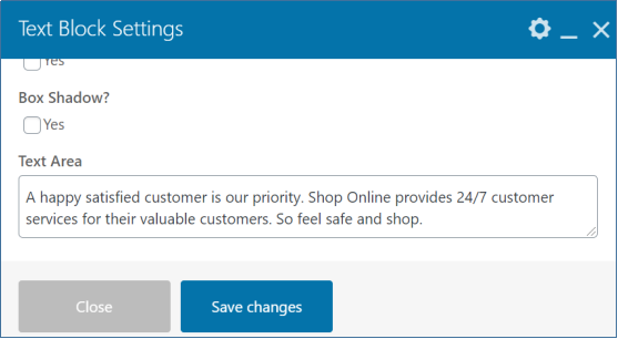
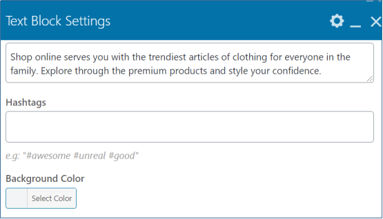
- After adding the row, click on the plus button to add a Text Block Element.
- To add text to the pop-up modal, we will use the text block element of WP Bakery.
- A dialog box will appear for text block settings. Add the text and do the custom CSS.
- Again, click on the plus button to append one more Element of buttons inside the pop-up modal block.

- Navigate to the PB Add-ons tab to select the button element.

- A dialog box will appear for settings. From the General settings tab, choose the style, add the text.

- From the Button settings tab, choose the shape and background color.
- Save changes and preview. The landing page will now look like this.
- On clicking the text, a pop-up box will appear.
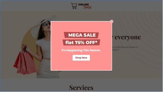
(We have chosen design 1 of variation 3 for the Pop-up Modal.)
Services Offered by the Store
The services section makes you stand out in the market and describes what your company or business has unique. They provide more details for your customers and the benefits your company has to offer
To showcase our services, we will use the Services element of the PB Add-ons for WP Bakery Page Builder.
- Click on the plus button below the last added row to add a section element.
- After adding the section, click on the edit button to do the settings.
- Now, click on the plus button to add a row element.
- After adding the row, do the editing by clicking on the edit button on the right.
- Click on the plus button inside the row and add the Text Block Element from the PB Add-ons Tab.
- Add the Heading, Text, and customize the Font Family, Styles, Color, and border styles. Save Changes.
- Click again on the plus button below the Text Block Element to append another
- After adding the row, click on the plus button and navigate to the Page Builder Add-ons tab to add the Service Element
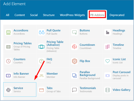
- A dialog box will appear for settings. From the General settings tab, select a Theme Style, Category, Font Family, and Style.
- From the Desktop settings tab, select the number of services you want to be displayed in a row as per the screens.
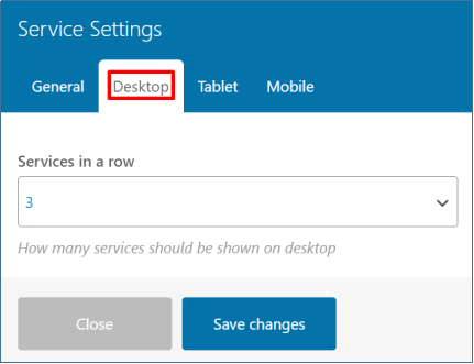
- Save the changes.
Adding Services
For showing up the services on the landing page, we will first need to add them in the PB SERVICES.
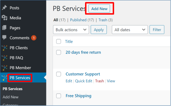
- Go to the Admin Dashboard and click on the PB Services.
- Select a category, and you will see this page in which we will add a new category. Add the name of the landing page.
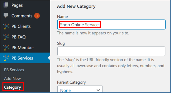
- Scroll down and click on the add new category button to add a category on your page.

- Next, click on the PB Services to add new services in the category.
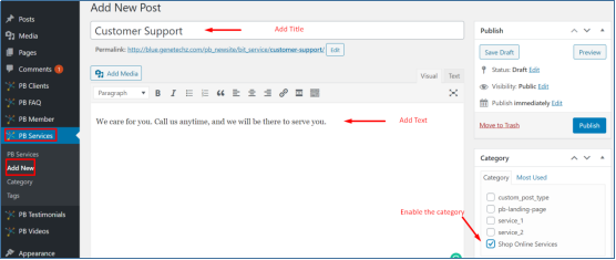
- Add title, text, and enable the checkbox of the category you want to keep this service in.
- We will select Shop Online Services to add this service to our page.

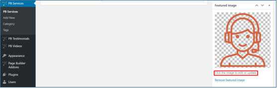
- To add the icon image, scroll down to the bottom of the same page.
- You will add the icon image in the featured image tab on the right.
- Save your work by clicking the Publish button on the right.
- Do the same for all the services you are offering. The landing page will now look like this on the preview.
(We have used THEME 1 of the Services Element of PB Add-ons)
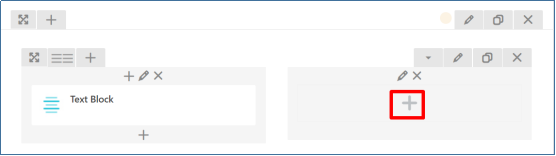
Text Block for Shops Intro
Just below the Service section, we will add a brief introduction of the store with an Image.
- Click on the plus button below the Services section’s last added row to add a section
- Edit the section and add the background image.
- Add a row element by clicking the plus button inside the section element.
- Edit the row layout to 1/2 and 1/2for the Image and Description, respectively.

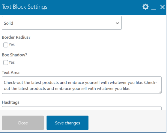
- Click on the first section’s plus button and navigate to the PB Add-ons tab to add a Text Block Element.
- A dialog box will appear for text block settings. Choose the theme style, Add heading, choose border styles, alignment, add text.
- Choose a color for the heading and text. Save changes.
- Click on the second column’s plus button and add a Single Image Element from the dialog box.
- Edit and customize the Image as per requirements.
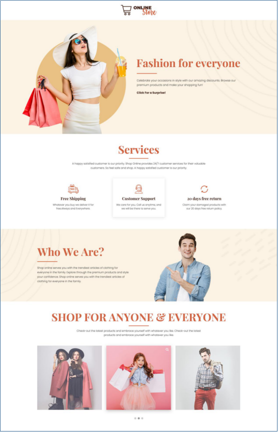
- Save changes and preview. The landing page will now look like this on the preview.
Gallery with an Image Carousel
Images paint a thousand words is well-known to all of us. Then why not use them on your landing page to capture user’s attention and increase conversion rates. To show the products of our store, we will use the PB Add-ons Image Carousel element.
- Click on the add button to add a section element, just below the last added row.
- Add a row after adding the section.

- Again, click on the plus button and navigate to the PB Add-ons tab to add a text block element.
- In the dialog box, add the heading, text, choose styles, alignment, and color.
- Save changes and close the dialog box.
- Click on the plus button to append one more Element.
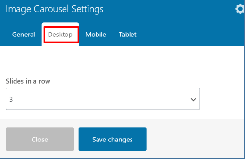
- Navigate to the PB Add-ons tab to add the Image carousel element.

- From the General Settings tab, select a theme style. We have chosen Theme 2 for our page.
- Click on the toggle tab to add an image.

- Click on the clone button to add as many images as you want.

- From the Desktop Tab, choose 3 to show in a row. Select 2 and 1 for tablet and mobile, respectively.
- Save changes.
- The page will look like this in the preview.
(We have used Theme 2 of Image Carousel)
Footer With Social Media Links
Footers are the critical place to showcase the badges of trust, which can be your social icons. To give a compact look to our page, we will add Social Icon Buttons from the PB Add-ons Button Element in the footer.
- Add a new row below the image carousel section.
- Split the row into two columns by selecting custom layout option 1/2 + 1/2.
- Click on the edit button to edit the row and add Background Color from the Design Options tab. Save Changes.
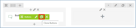
- Click the plus button in the first column and navigate to the PB Add-ons to add the Buttons Element.

- For Social Media Buttons, choose theme style one and add the Link (URL).
- From the Button settings tab, add the Icon for the social media platform and customize the shape, size, background color, text color of the button, and save changes.

- To add more Buttons, click on the Clone button and change the icons and URL for other social media platforms.
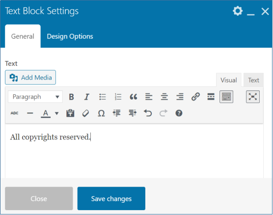
- Click on the plus button in the second column to add a text block.

- Add a Text-Block Element from the dialog box.
- You can add copyright text or any other text suitable to your requirements. Customize the text from the Text editor, and save changes.
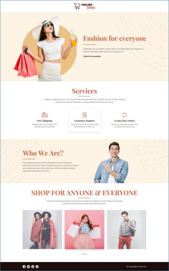
- The Landing page on the preview should look similar to the one below:
NOTE
- By default, WP Bakery Page Builder gives you a blank template.
- WP Bakery also offers a wide range of free and paid themes with various templates for your custom website or landing page.
- If your custom templates or themes does not have an option for a blank template, you can remove the Header and Footer using the custom CSS.(screenshot below)
Conclusion
Marketing through landing pages help accelerate your sales and generate revenue. Well-designed landing pages allow you to reach the target effectively.
You can design a wide range of landing pages using the WP Bakery Page Builder Add-ons, which are responsive and customizable.
What elements do you use to make a landing page? Please let us know in the comments section. We would love your feedback.
